
Reka
Health.
User Interface Design Guidelines

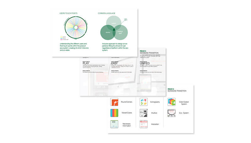
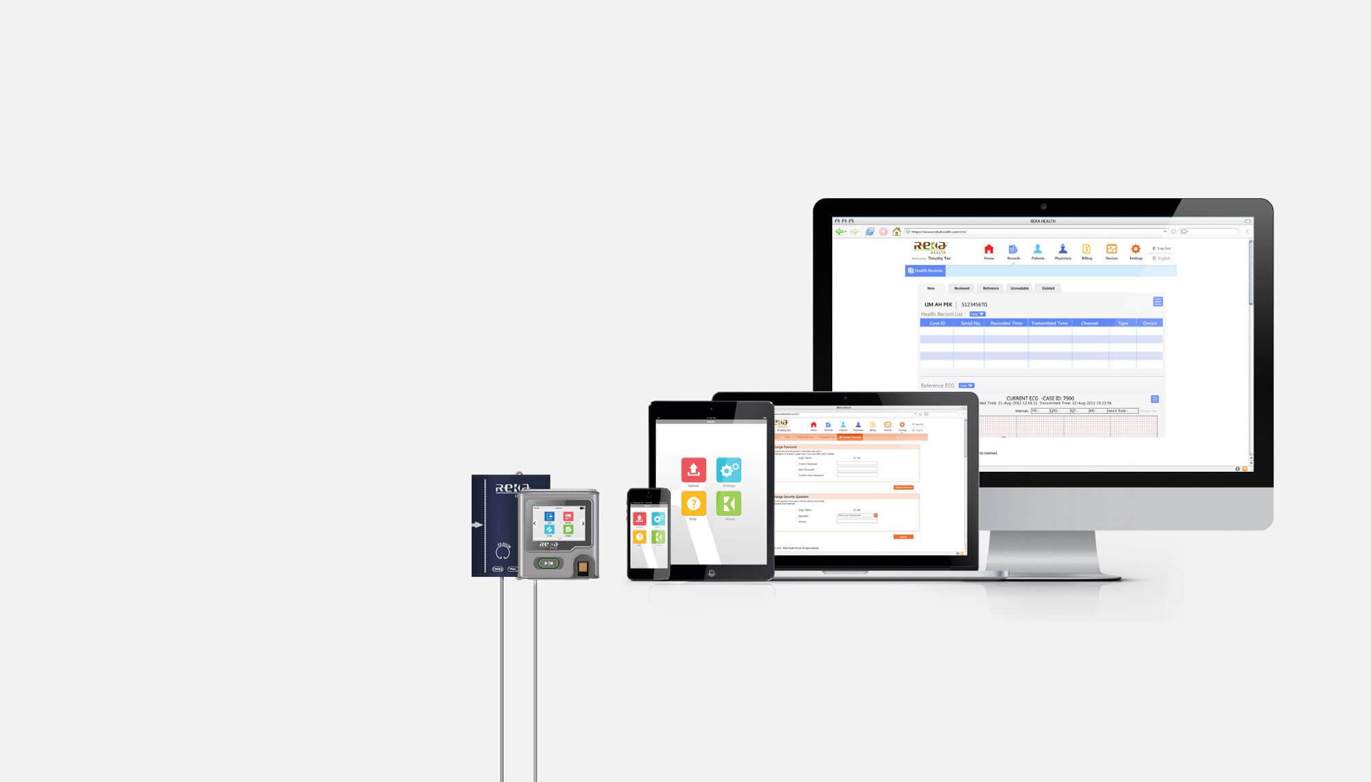
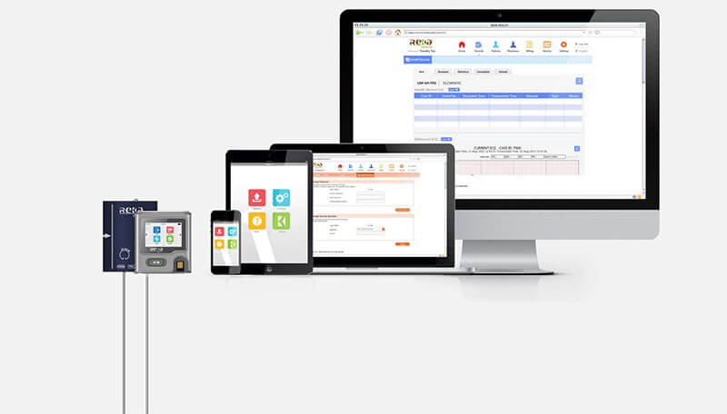
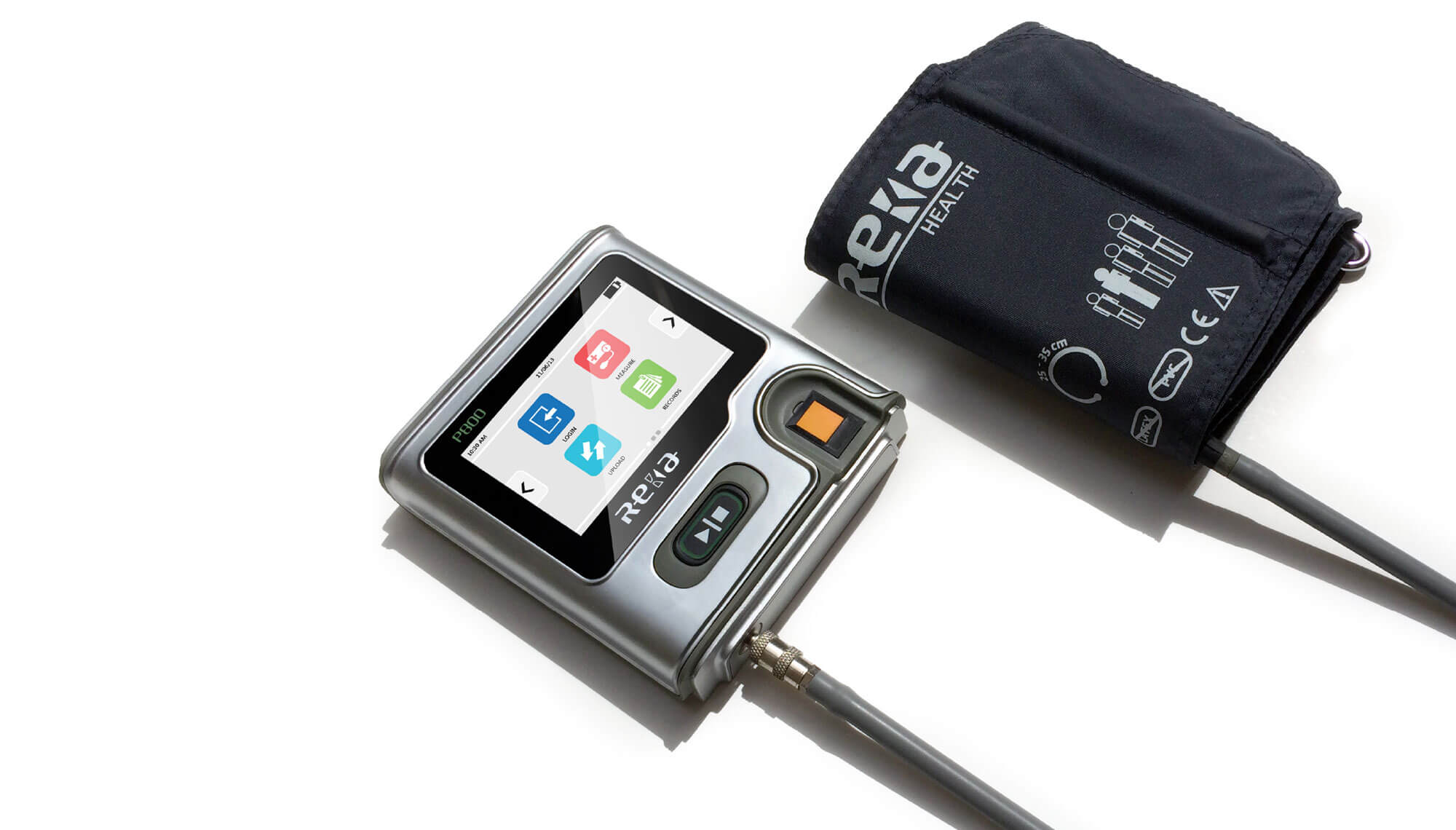
Reka Health and NextOfKin partnered to unify the mobile healthcare platform provided by the company and determine User Interface guidelines for the team of designers and software developers. In this revamp-rebrand exercise, we took the opportunity to deep dive into the various workflows to reduce, refine and redesign the technical and complicated information output into friendly and bite-sized info-pops . With “easy self-care online” set as the guiding principle, we created a warm and playful colour-coded segments to define the different levels of users, from the patient, families, care-takers to the healthcare professionals like nurses and doctors.
Wireframe
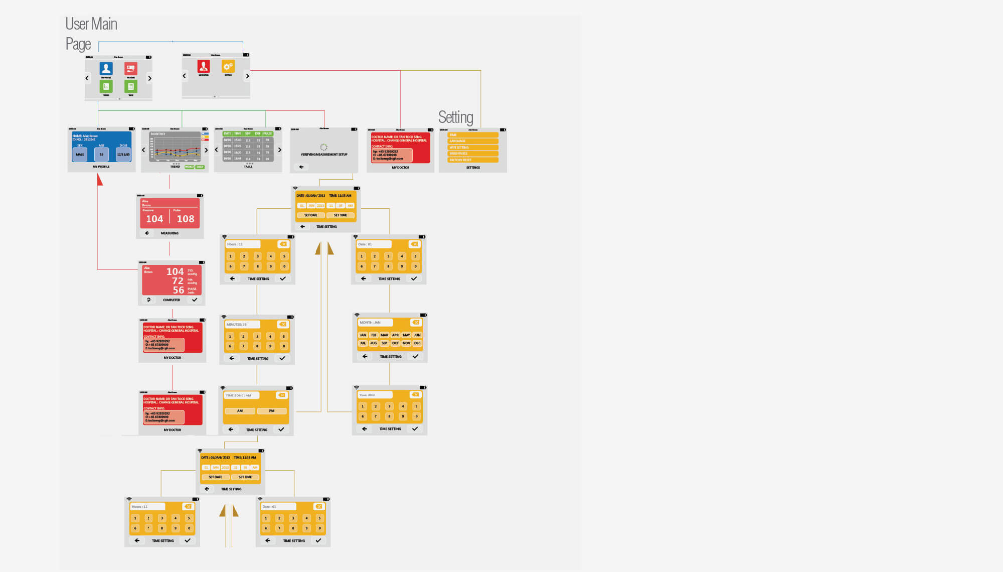
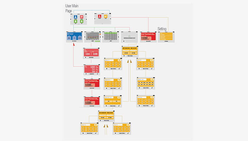
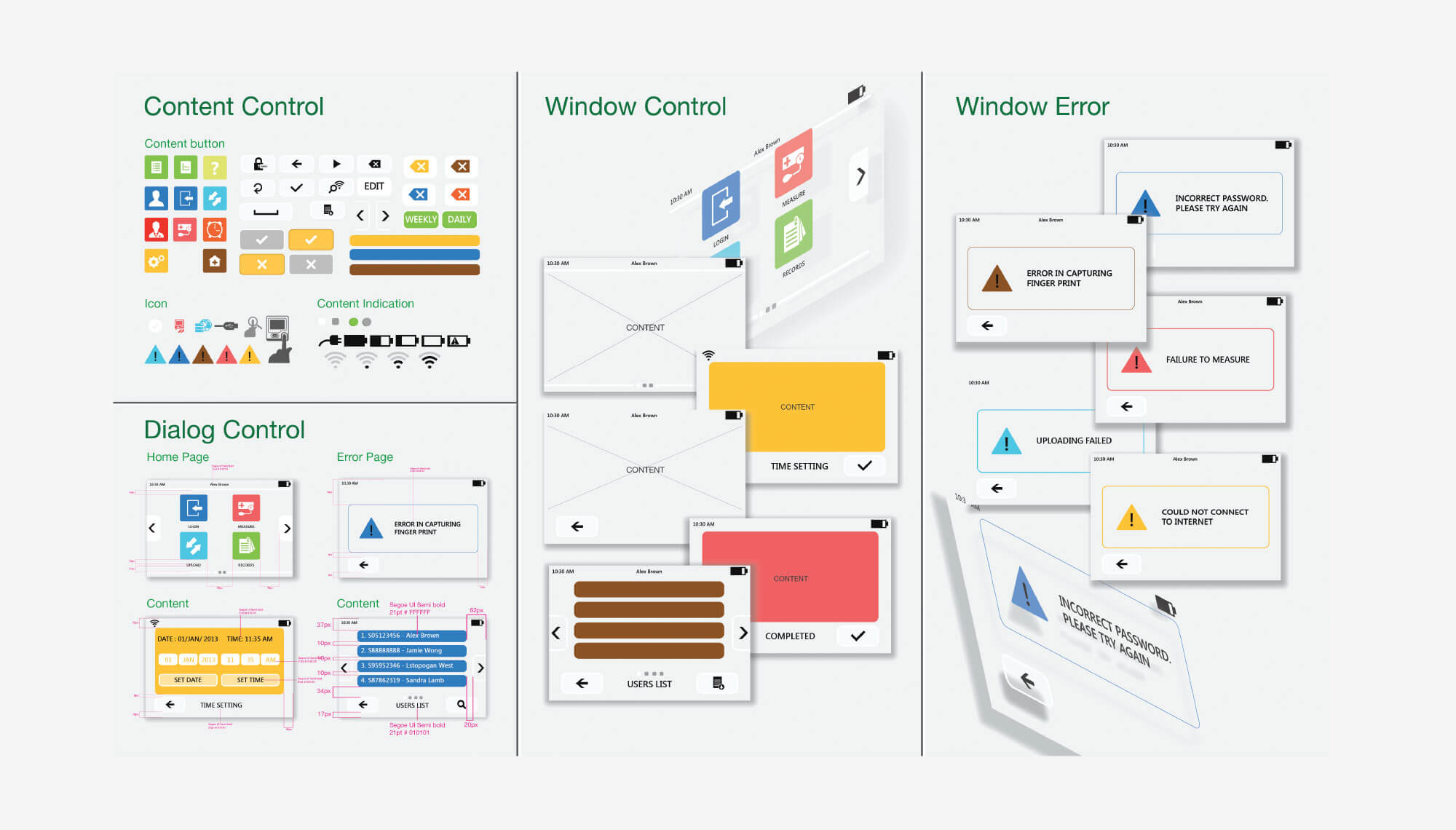
We mapped out the wireframes of different workflows carefully to find a commonality between the different levels of user needs. We shadowed selected patients and healthcare professionals to observe the ethnography flow and gain insights on the multi-stakeholder user needs and habits. We developed a seamless navigation flow of the system where doctors search and monitor with minimal clicks and patients upload and consult with minimal disruption to their daily routines.
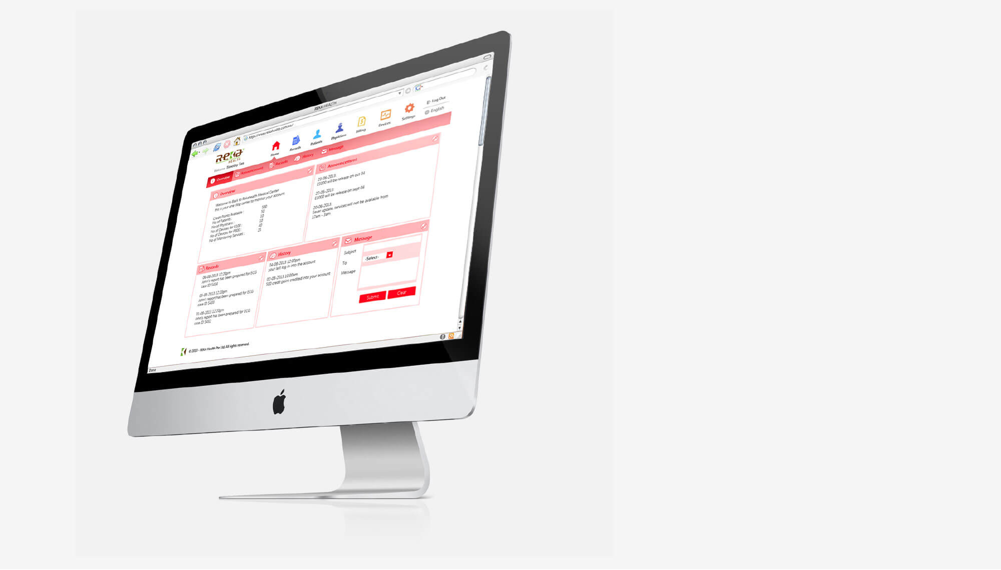
Telehealth
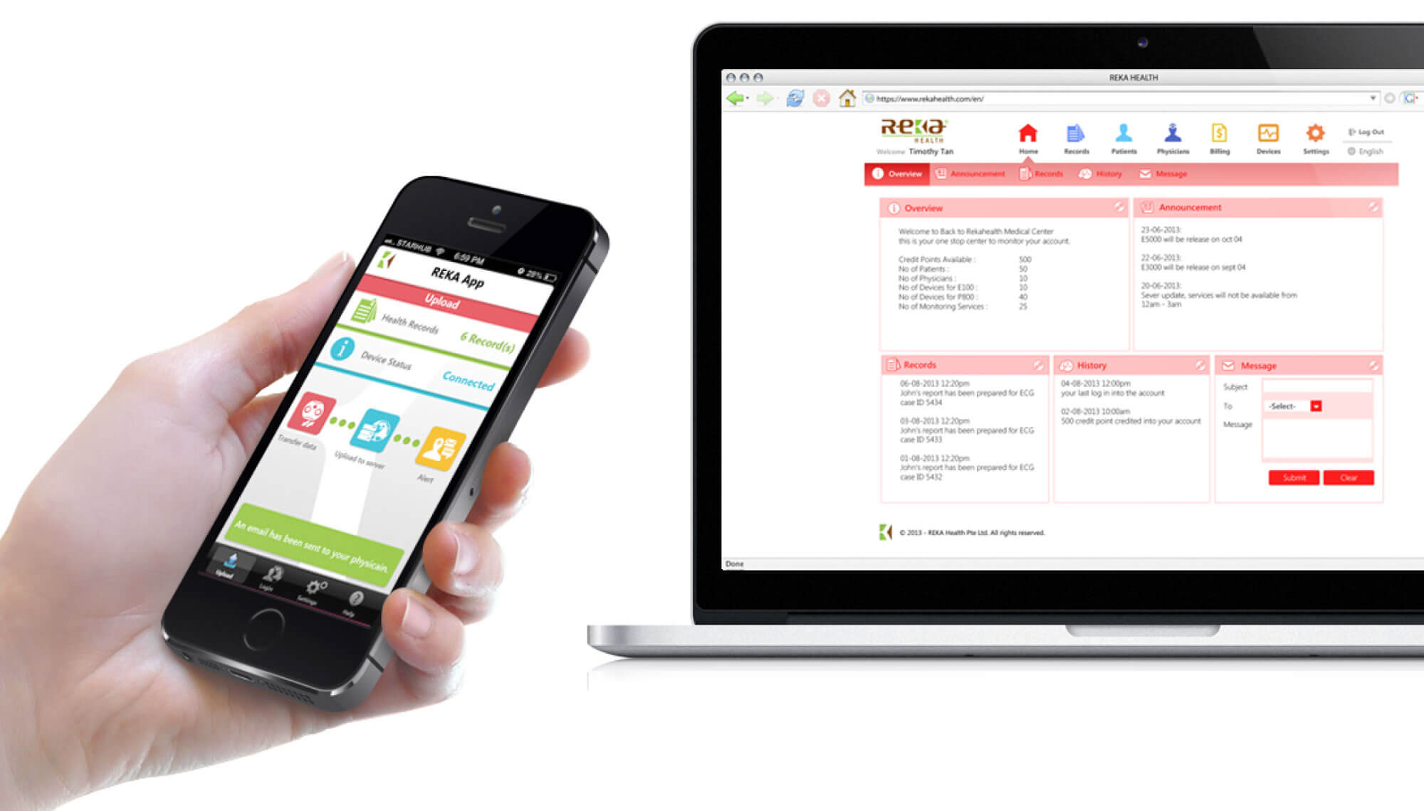
With the Telehealth solutions being the core service platform, we applied our User Interface guidelines to refine the work flow with their software team and designed a backend website with the info-pops driven information grid. This became the one-stop main window of contact between all Reka devices and stakeholders of the health data. It is the operational hub where all information records was shared and stored and online payments were collected and tracked. We were glad that the system improved the overall workflow, our translation: Happy users, better health!
2013
What we did
Visual Language
Product Design
Colours Material Finishes
Coming up next
SennheiserCX 1 and CX 2 series.
Related project
Alienware Facial RecognitionUI Design.