
Sinflora Rebrand.
Reigniting passions, connecting communities.
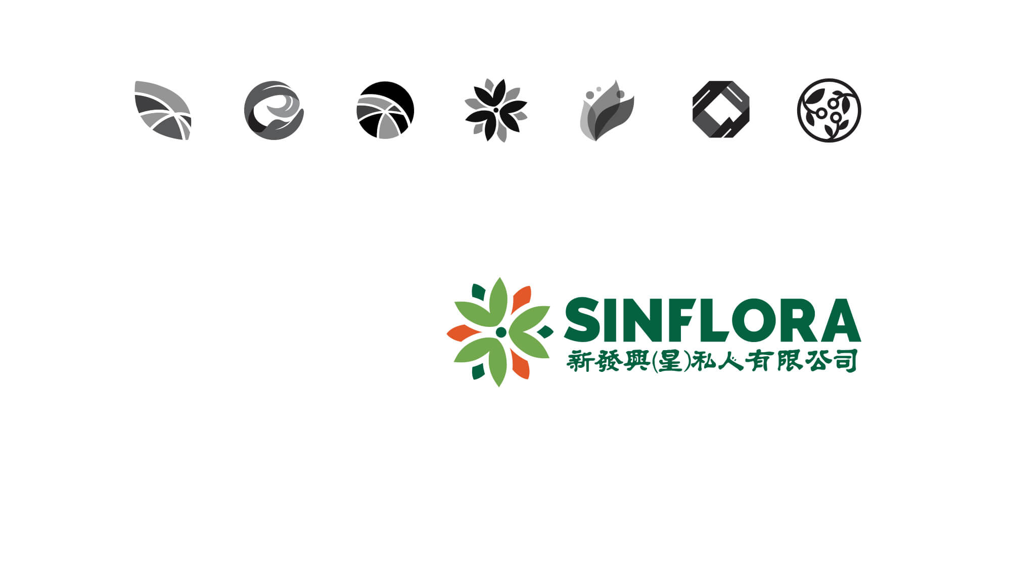
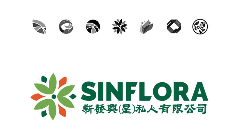
Rekindling What Matters
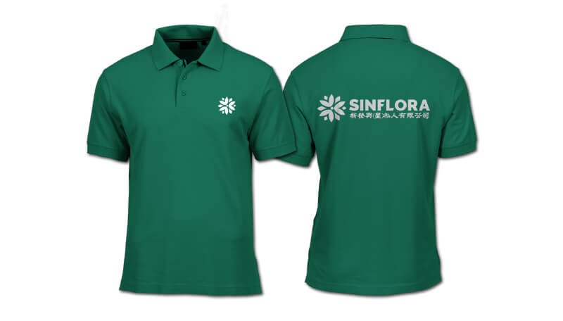
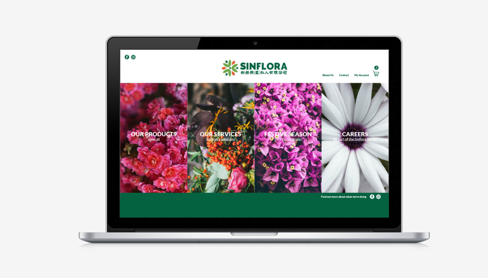
Designing Sinflora’s logo was based on a one fundamental concepts: to rekindle. Rekindling passion, interest, moments and a sense of community within and around Sinflora. The three petals represents Sinflora’s customers, plant lovers and families and friends that make up its community. The overal petal shape resembles a spark that shows rekindling.
Keeping Rooted
The brand and logo needed a refresh, yet needed to preserve its roots and origins. Its original deep shade of green that symbolised wealth and luscious nature and original handwritten Mandarin text in its original form was kept for the well-established brand.
2016
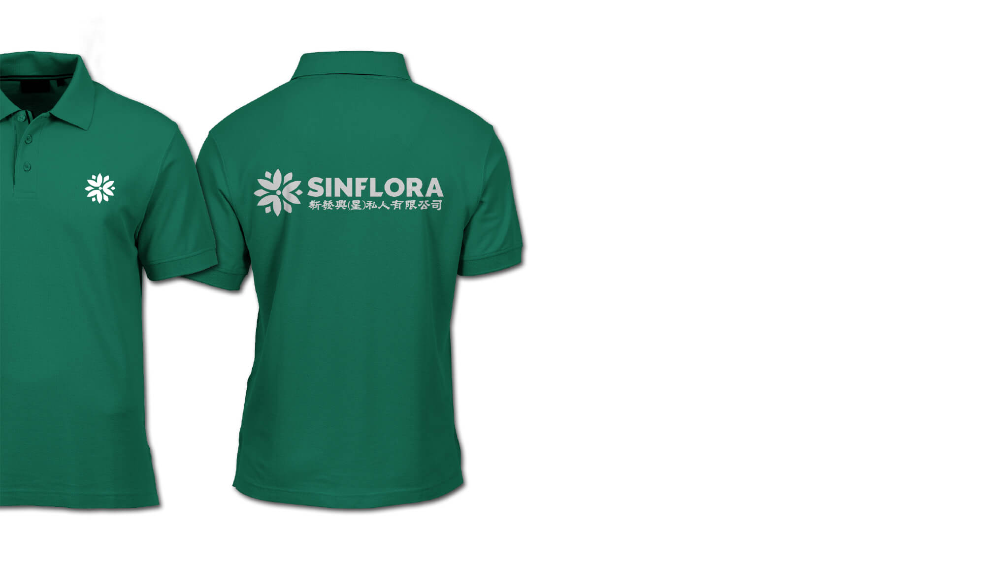
What we did
Logo Design
Branding
Visual Communication
Coming up next
Skylace Language School Branding.Related project
Skylace Language School Branding.