
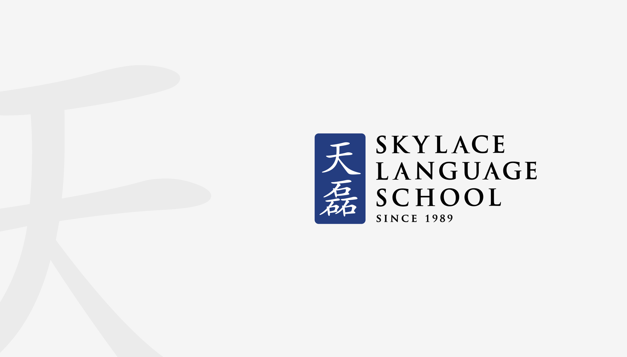
Skylace.
Brand Identity for a local established Chinese tuition centre.
Trinity Logo
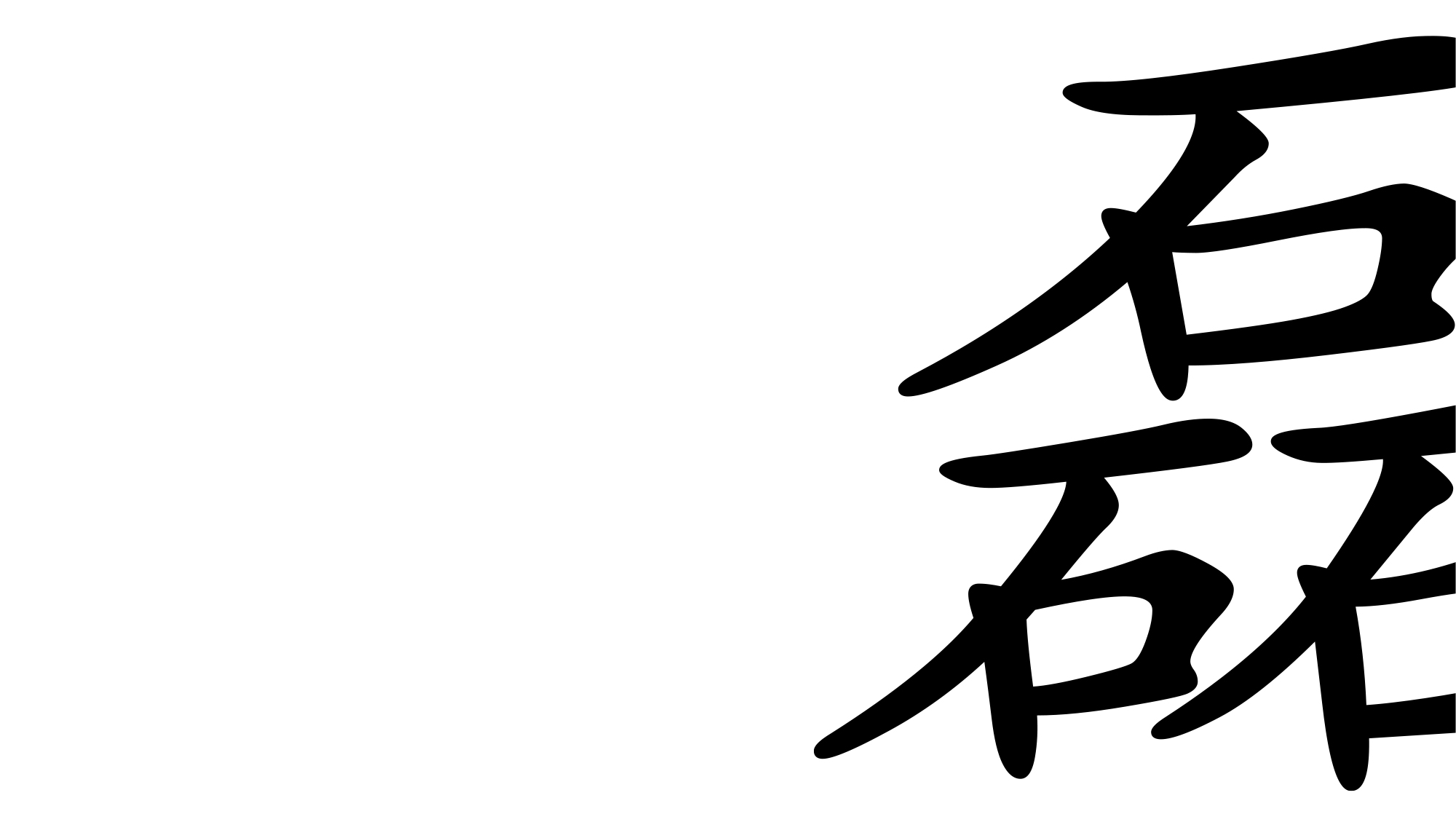
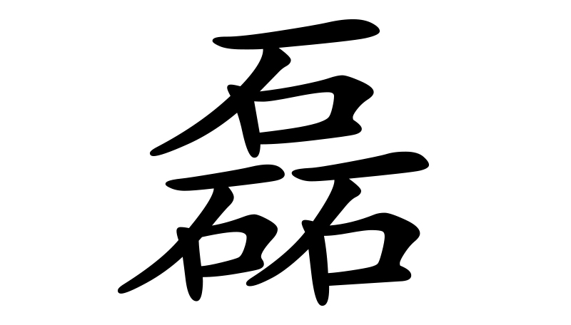
Skylace’s key word ‘磊’is made up of 3 stones (in the mandarin chacter) that represent their three original founders. We wanted to keep its look professional, well-established and grounded.
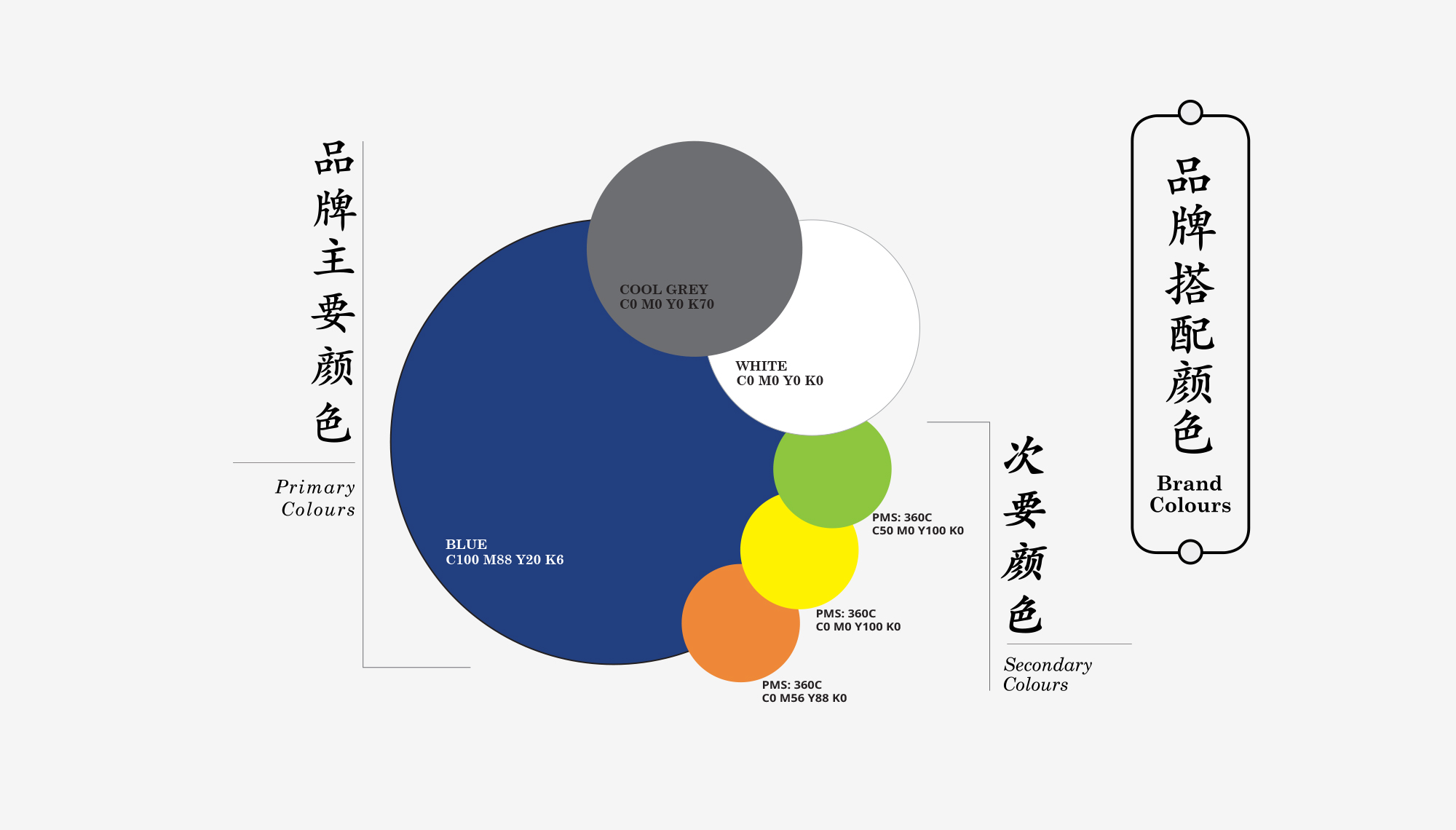

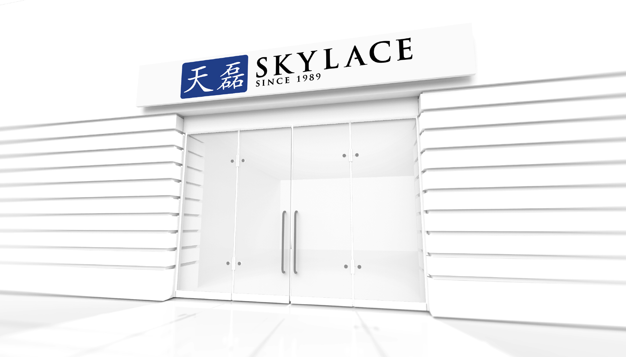
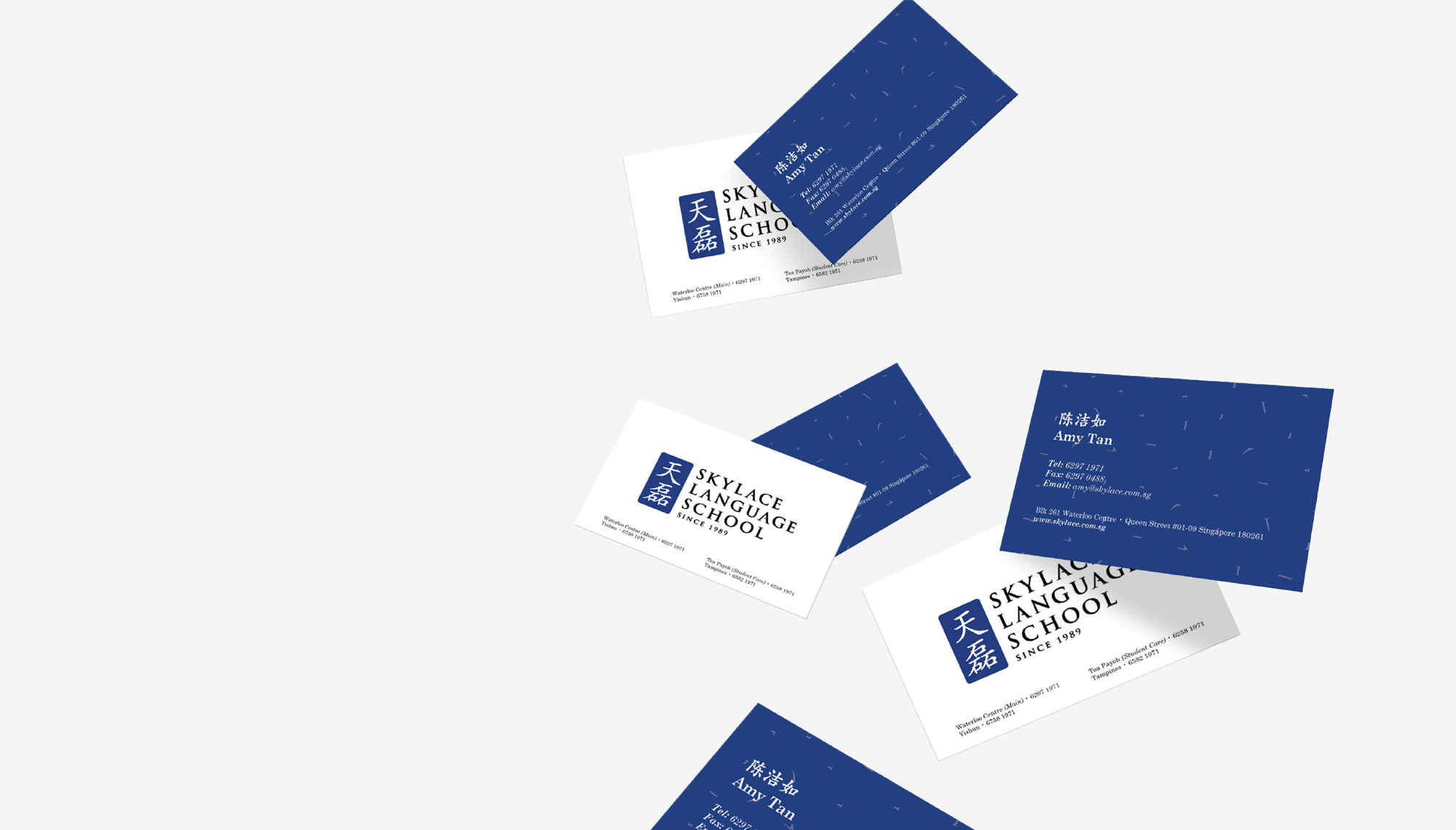

Skylace Blue
Retaining the brand’s original deep shade of royal blue and paper white presents a clean and minimal look.

2016
What we did
Logo Design,
Brand identity,
Visual Communication
Coming up next
TeleRadio Skydroner.Related project
URC Jack n Jill Potato Chip Packaging Rebranding.