

Jack’n Jill
Potato Chips.
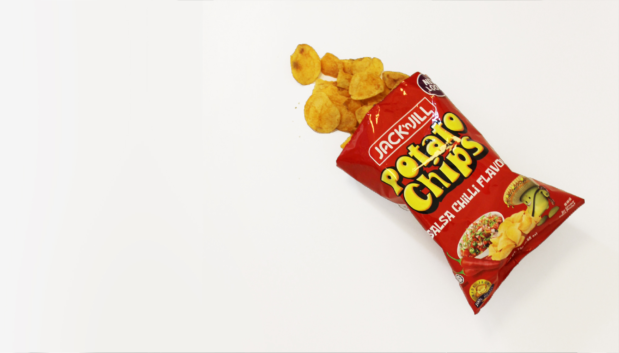
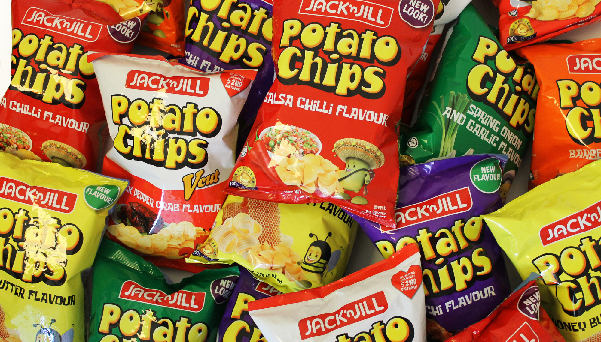
A refreshed packaging for a beloved household potato chip brand
A Familiar Face
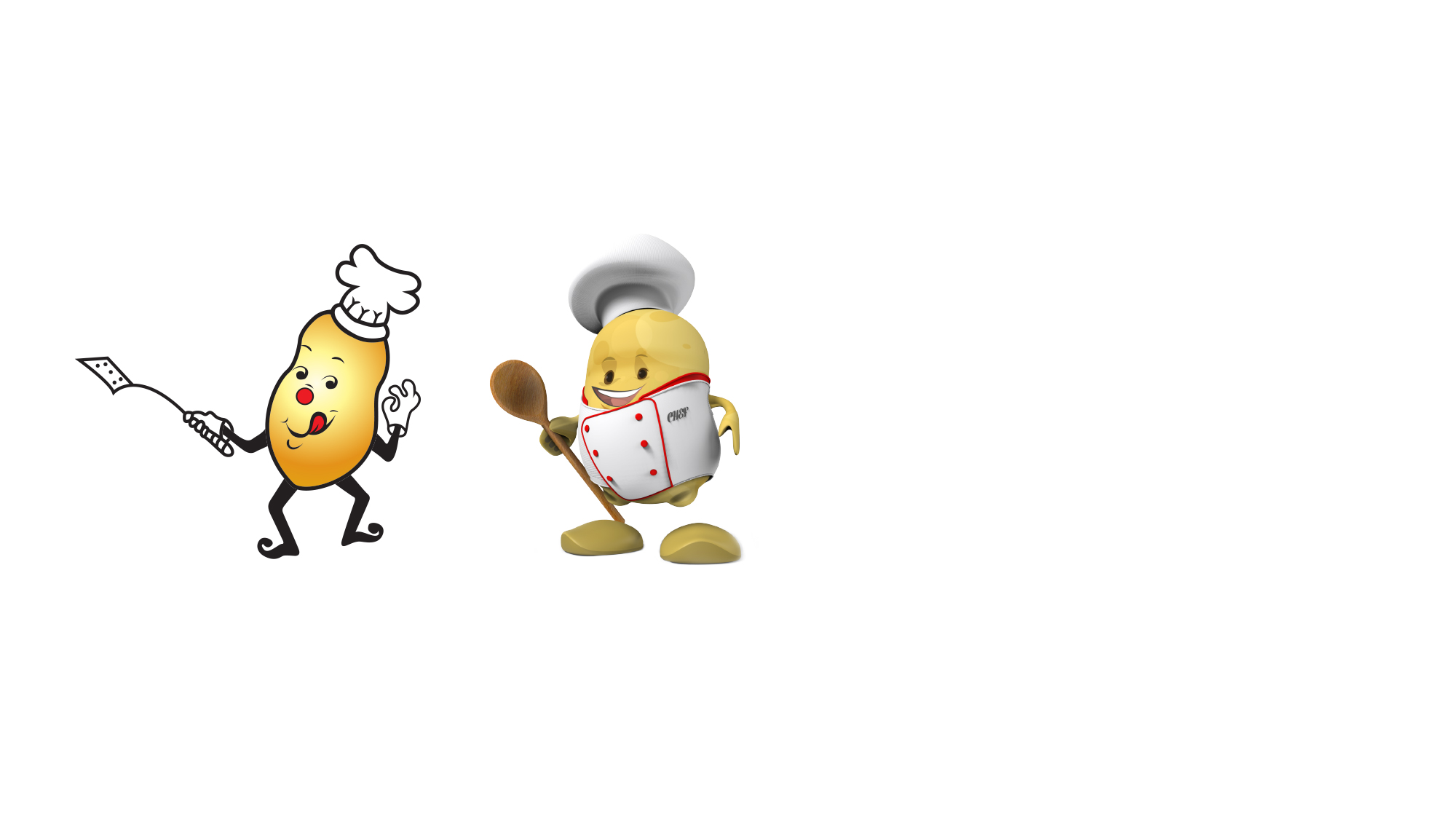
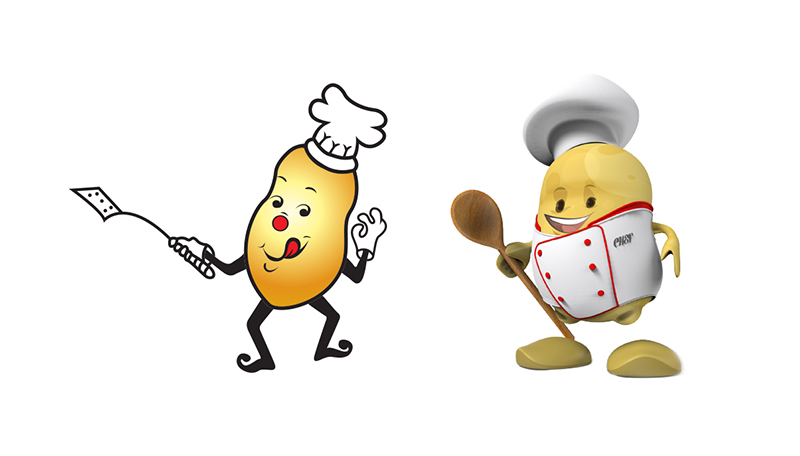
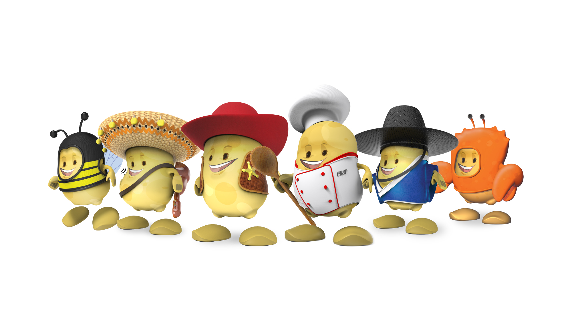
Using Jack and Jill’s familiar potato mascot as a starting point, we gave it a fresh, modern day design and look, giving it a 3-dimensional apperance while preserving its cheerful and fun demeanour that we’ve all grown to know and love.
Meet the New Family
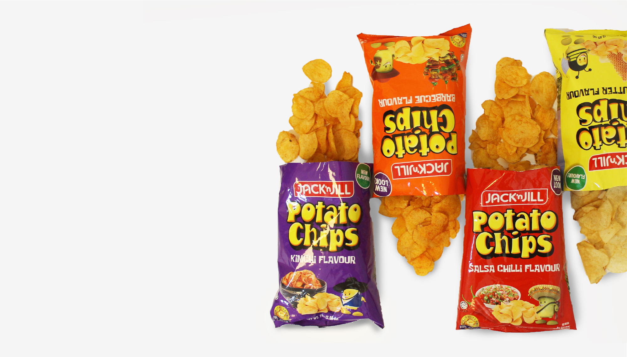
New characters were created for new flavours like Honey Butter, Kimchi, and even special seasonal edition: Black Pepper Crab. Existing flavours’ mascots were refreshed as well, giving the entire potato family a whole new look and fun appeal. Fresh and vibrant colours were given to match the overall feel.

2016
What we did
Character Design
Packaging Design
Visual Communication
Coming up next
Cyden Smoothskin Bare.Related project
Hegen Launch Campaign.