
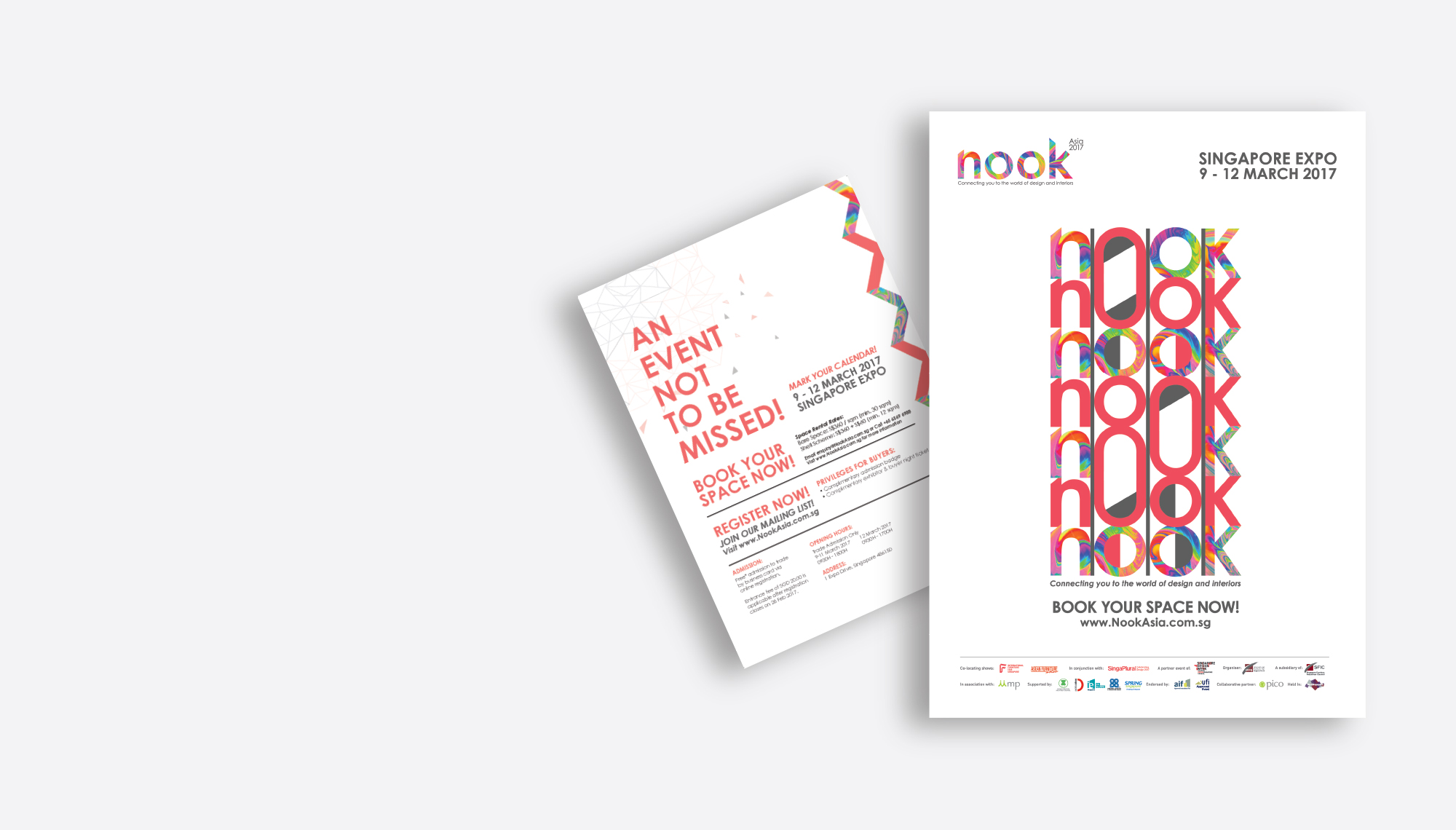
Nook Asia
Branding.
Re-branding for home furnishing exhibition

Nook Asia
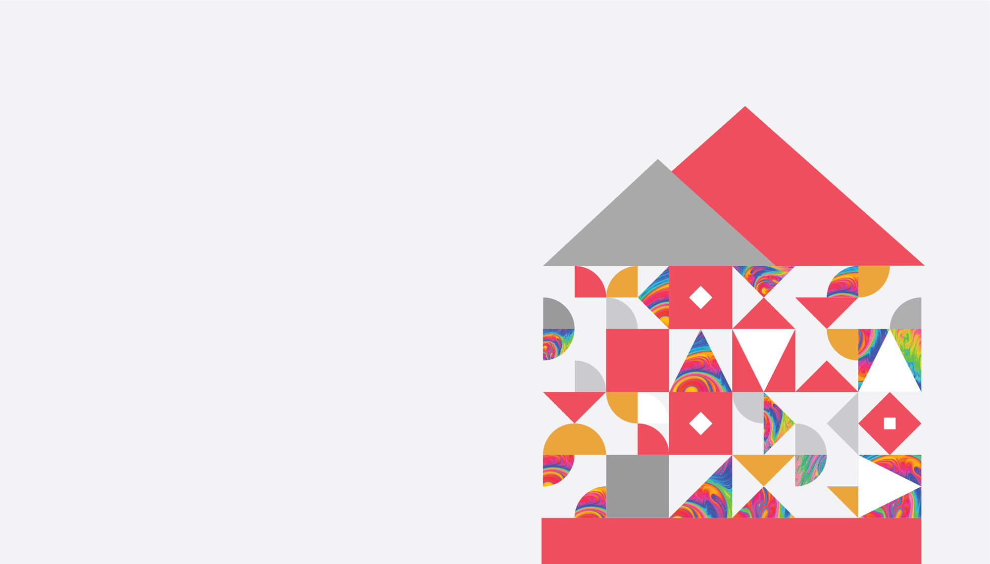
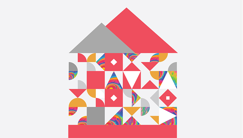
An accompanying trade show of International Fair Singpaore, Nook Asia is a decor show that showcases soft furnishings, lighting and fabrics. The slanted edges of the ‘n’ and ‘k’ in the logo together gives a subtle suggestion of the roof of a house - a place where one wishes to furnish and make a home of.


Kaleidoscope
The kaleidoscope of colours is used extensively in the branding to show the colours one can a fill a space with with Nook, and represents the plethora of offerings Nook provides at its show every year from countries across the globe.

2015
What we did
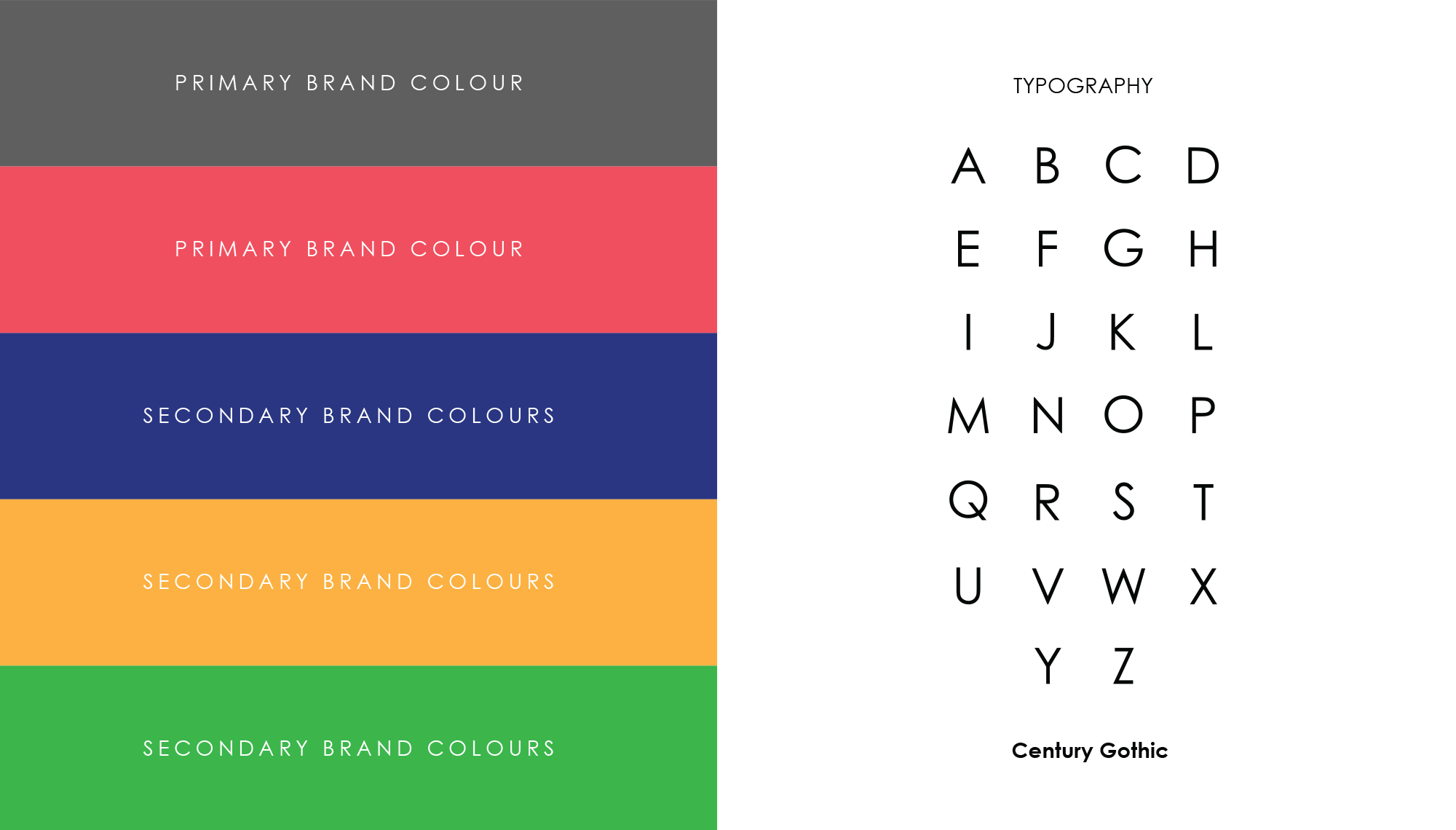
Branding and Strategy
Logo Design
Collateral Design
Coming up next
NOKGEAR ScootBoard.Related project
SFIC Rebranding.